Article : Solid-colour furniture: our 6 shades of grey
How can you decorate your home using plain colours?

How can you decorate your home using plain colours?
To bring freshness, cheerfulness and contrast to your interior, dare to use bright, solid colours! In this article, we present the variations of solid colours we offer from our wide palette of 80 colours. And, you'll see that they're not so complicated to combine!
From left to right: 0112 Stone Grey, 0881 Aluminium, U1102 Clay Grey, U1191 Congo, 0859 Platinum, U963 Anthracite Grey
Grey is a chic colour. Your guests will notice that you have taste and that you look after your interior, with elegance and delicacy.
From Stone Grey to Anthracite Grey, via pearl and semi-matt textures, we offer you 6 shades of grey. Make good use of them!
From left to right: U1717 Sixties Blue, U0591 Gentian Blue
Blue, or passe-partout colour, is universal and timeless. Soothing, it's a trendy colour that suits all interiors.
Use Sixties Blue to soften your interior. In fact, it's perfectly suited to a child's bedroom.
Or add character to your room by using Gentian Blue: make it stand out by contrasting it with light wood such as oak, or lighter plain colours such as beige or even white.
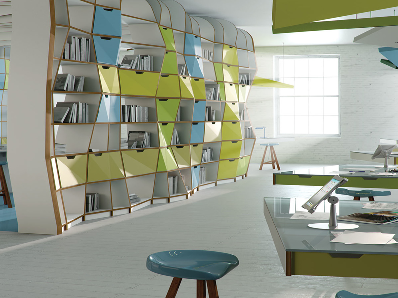
From left to right: 7190 Apple Green, U19007 Agave
Contrary to popular belief, green is not that difficult to match. In fact, it has the same virtues as blue. A reassuring and soothing colour, it's a natural colour that meets a number of needs: increasing luminosity, adding freshness, or creating a refined effect. Convinced? Then make your choice between our Apple Green and Agave colour.
From left to right: 0134 Bright Yellow, U1667 Orange
Yellow is THE warm, bright colour par excellence. It is a colour full of qualities, which is pleasant to live with. It's straightforward and brings energy and good humour to the home. It's easy to combine with other colours, such as complementary violet, blue, green or oak.
Like yellow, orange is a colour that warms up your home. It makes you look good, facilitates communication and is reassuring. It's a bright colour without being aggressive. Your guests will feel welcome. When it comes to combining colours, opt for blue.
From left to right: U363 Flamingo Pink, 7167 Violet, U311 Bordeaux Red, U1669 Carmine Red
Blackberry, cherry, strawberry... Red fruit tones are also making their way into our palette.
Use Flamingo Pink for a soft, tender atmosphere; Violet, a trendy colour, for a sober, warm ambience; Bordeaux Red, in its dark tones brings a serious tone. On the other hand, Carmine Red, a colour of character, can bring dynamism and energy to your interior. It's the most powerful colour, so it easily takes over. Use it more as an "accessory", as a shelf or door colour for example, in contrast with your white furniture.
So here are the colours we suggest. Did you like them?
Then head over to our configurator to make your furniture entirely bespoke!